Is your website mobile-friendly? The quick test every tradesperson should do
Added on 15th June 2026
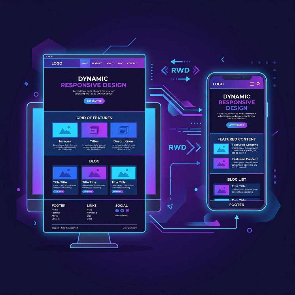
The 30-Second Mobile Usability Test
Stop reading this for a moment. Pull out your smartphone, open your web browser, and search for your own business website. When it loads, take a brutally honest look at the experience from the perspective of a brand new customer in a rush.
Ask yourself these critical questions:
- Do you have to pinch the screen to zoom in just to read the paragraph text?
- Do you find yourself having to scroll sideways to see the right edge of your pictures or tables?
- Are the menu links or 'contact us' buttons so small or close together that you accidentally tap the wrong one?
- Does your phone number require the user to copy and paste it, rather than just tapping it to make a call?
If you answered "yes" to any of those questions, your website is fundamentally broken for the majority of your audience.
Why Mobile-First is No Longer Optional
In 2026, well over 60% of all internet traffic comes from mobile devices. For local tradespeople, this number is often much higher. If someone has a burst pipe or needs an emergency locksmith, they aren't booting up a desktop computer; they are frantically searching on their iPhone while standing in their kitchen.
If a potential customer lands on your site in a moment of need and can't instantly read what you do or find your phone number, they will hit the 'back' button and go straight to your competitor. You have roughly 3 seconds to prove your site works.
The SEO Impact: Google's Mobile-First Indexing
It's not just about human frustration; it's about search engine visibility. Google now uses 'mobile-first indexing' exclusively. This means Google's bots crawl and judge your website based entirely on how it performs and looks on a smartphone simulator.
If your mobile site is poor, slow, or difficult to navigate, your Google rankings will plummet across the board—even when people search for you using a desktop computer. A non-mobile-friendly site is an invisible site.
The Solution: True Responsive Web Design
The days of having a separate "mobile version" of a website (e.g., m.yourwebsite.com) are long gone. Modern, professional websites use 'Responsive Design'.
Responsive design means the website automatically and intelligently detects the size of the screen it's being viewed on—whether that's a massive 4K monitor, an iPad, or a small smartphone—and fluidly adjusts the layout to fit perfectly. Columns stack vertically, text sizes increase for readability, and navigation menus compress into easy-to-use tap targets.
If your website isn't responsive, you are actively losing jobs every single week. It's time for an upgrade.